Trendaavat aiheet
#
Bonk Eco continues to show strength amid $USELESS rally
#
Pump.fun to raise $1B token sale, traders speculating on airdrop
#
Boop.Fun leading the way with a new launchpad on Solana.
In case you followed me long enough, some background on the evolution of my visual ID.

9.1.2024
Ten years ago I created this account as a pure parody of the future owner of this website. Halfway into that time I began shifting my content and commentary to reflect more of “me” and away from just playing a character. (Even though the former is what earned me 1mm+ followers).
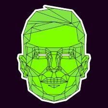
Accordingly, my visual “appearance” became simpler and simpler as a means of differentiating myself even more distinctly. I didn’t want to live in rocket man’s shadow forever.
Eventually, exactly 1 year ago, an artist by the name of @jackbutcher created an ultra-minimalist design that I felt was a perfect way to complete the transition away from the familiar human face I had riffed off of for so long.
The design, an “Opepen”, encompassed three important aspects of my brand:
1) Bored: Clearly displayed in the eyes
2) Neon Green: A color I’ve used across every avatar over my 10 year journey
3) Frog: A symbol of internet culture
It was a lovely trifecta of visual cues that gave me exactly what I needed to expand my own unique identity over the next ten years.
I share this today on the anniversary of the @opepenedition project launching to let Jack and team know how special this design was for me, and to express gratitude for the hard work that has gone into, and will continue to go into this wonderful experiment.
Congrats, and thanks for your masterful and transparent design work. Can’t wait to see what you do with the next 365


12,89K
Johtavat
Rankkaus
Suosikit


