Trendaavat aiheet
#
Bonk Eco continues to show strength amid $USELESS rally
#
Pump.fun to raise $1B token sale, traders speculating on airdrop
#
Boop.Fun leading the way with a new launchpad on Solana.
In today's charts that may look cool and suggest a pattern but you shouldn't jump to conclusions based just on it we have:
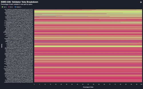
the @solana SIMD-228 Validator Vote Breakdown, which visualizes a prominent trend where smaller validators tend to vote NO, while larger validators vote YES

But also just look at the data if you want:

Also gonna drop the link to the secret chart in the tweet:
5,27K
Johtavat
Rankkaus
Suosikit


